H2 Deck By Bold Name
h2 xxxxxx
H1 xxxxxx
h2 xxxxx

Software & Analysis
Over the last 25 years, I found endless opportunities to use small Excel files to cut costs and boost profits, often by millions of dollars. By Jay Arthur
Big Money from
Small Data
Software & Analysis
H2 Deck Info By Paragraph Style Bold
Headline
There’s been a lot of hype about “big data,” but it’s mainly been focused on finding new ways to sell products to increasingly niche markets. In spite of all of the hoopla, have we really seen the kinds of benefits we expected? I haven’t.
While much of the business world has been obsessed with Lean Six Sigma, again, the returns have often been minimal compared to the investment.
Over the last 25 years, however, I found endless opportunities to use small Excel files to cut costs and boost profits, often by millions of dollars. It’s not hard, but it took me a while before I stumbled over the sequence that delivers results every time.
Defects, Mistakes and Errors
Every company collects information about its defects, mistakes and errors, usually in an Excel file or system (ERP, purchasing, invoicing, etc.), that can export data to Excel. Unfortunately, most companies fail to analyze this data or do anything about it. They seem to assume that nothing can be done, but that’s rarely the case.
I have found that there’s always a “Pareto Pattern,” meaning that these defects, mistakes and errors are never spread uniformly over the organization like butter on bread; they always cluster around a few process steps. It’s more like mold on bread, popping up here and there. Once you figure out the Pareto Pattern, it’s usually easy to diagnose and fix the problem. But most people don’t know how to find the Pareto Pattern, because they don’t know the power of Excel.
Excel’s Secret Sauce for Finding Profit
The Pareto Pattern is often hidden in row after row of data about the defects, mistakes and errors. Few people seem to know that Excel PivotTables will summarize this information and help find the Pareto Pattern. And few people know how to use PivotTables. And the user interface to PivotTables can be daunting.
There’s a lot of buzz in industry about “data analytics”—mining huge datasets to discover invisible patterns of customer behavior that can be leveraged to maximize sales. But I have found in the quality community that very few people know how to mine the hidden improvement projects (the invisible low-hanging fruit) in their existing data using Excel’s PivotTables.
Over the years, I have used Excel PivotTables on projects that:
- Reduced manufacturing scrap by $1,000,000 a year. Reduced order errors in a wireless company from 17% to 3% in just four months saving $250,000 a month in rework.
- Reduced denied insurance claims in a healthcare system that saved $380,000 a month with simple process changes that could be implemented immediately.
- Reduced waste in colostomy bag production by over $1,000,000 a year.
Using Excel PivotTables for data mining is the key to finding multimillion dollar improvement projects.
What Small Data Looks Like
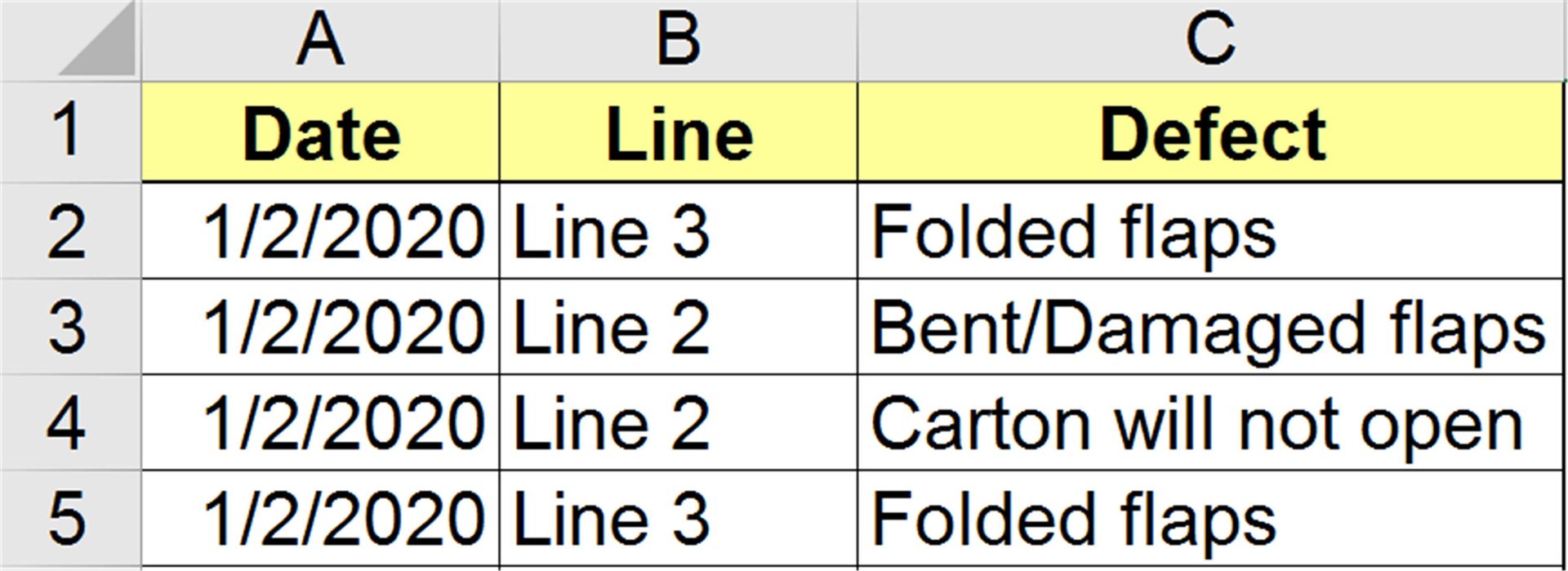
Almost every business I’ve ever consulted with has data about defects, mistakes and errors in an Excel spreadsheet. The data is a line-by-line, date-by-date, account of the origin and type of defect (Figure 1):
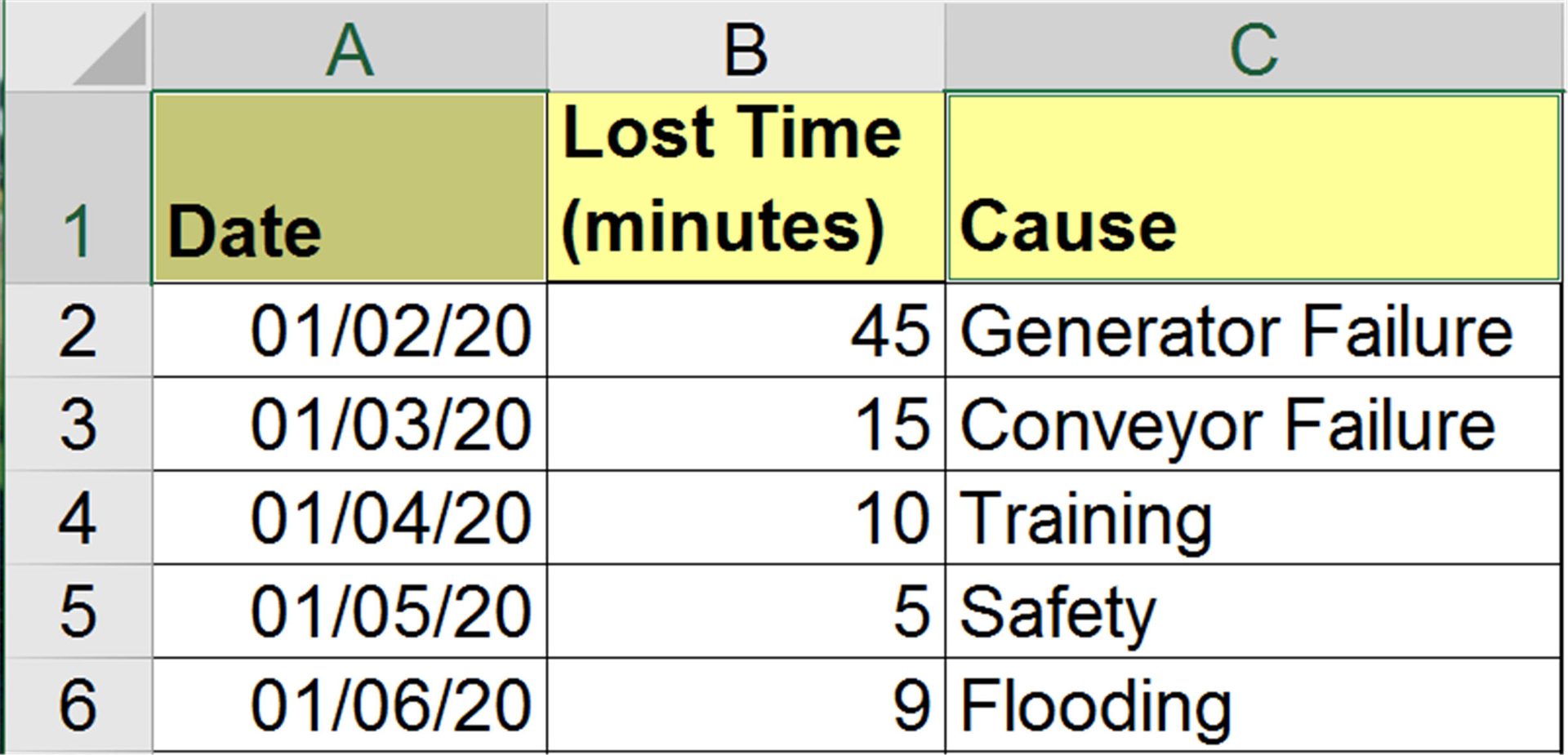
For lost time analysis (Figure 2), the data might look like this:
Turning Data into Improvement Projects
To turn this kind of data into something that can be analyzed requires the use of Excel PivotTables. PivotTables can:
- Count the occurrences of a keyword, phrase or number
- Sum or Average Numbers
- Turn Raw Data into Knowledge
- Help Drill Down into Mounds of Data
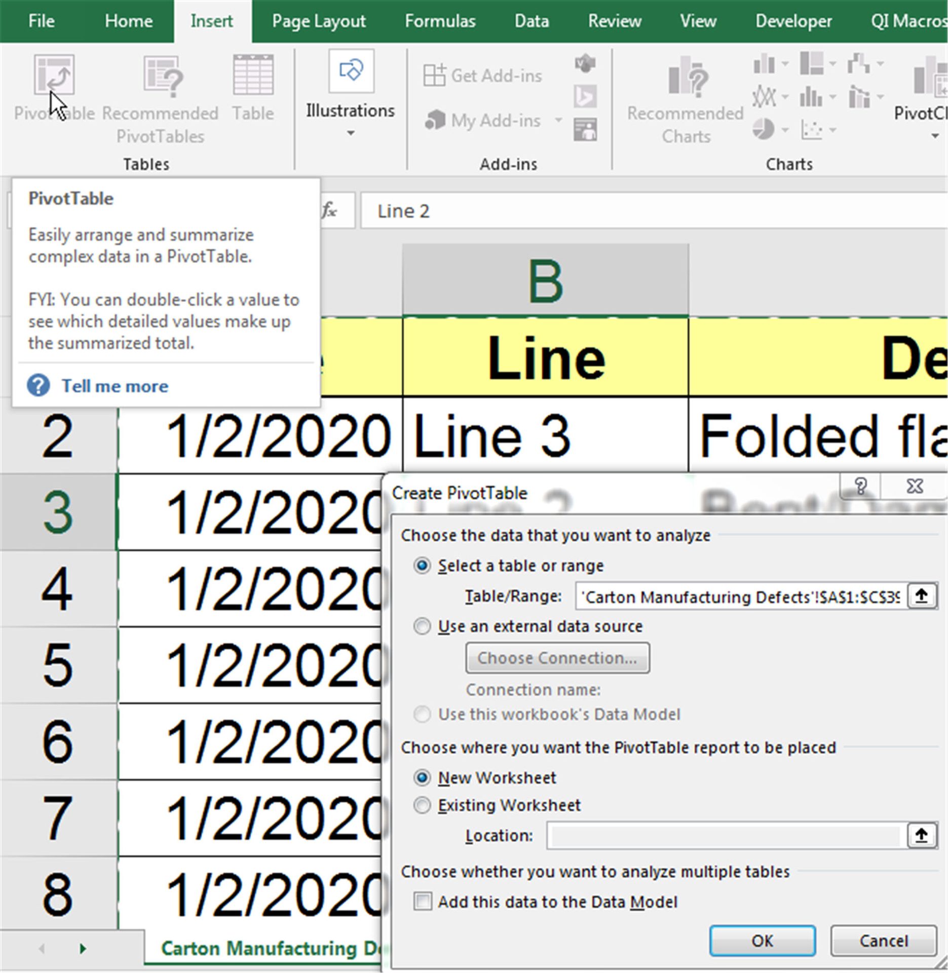
Using the first example, simply click on any cell within the range you want to summarize and then select Insert-PivotTable (Figure 3). Excel will automatically select the data for you:
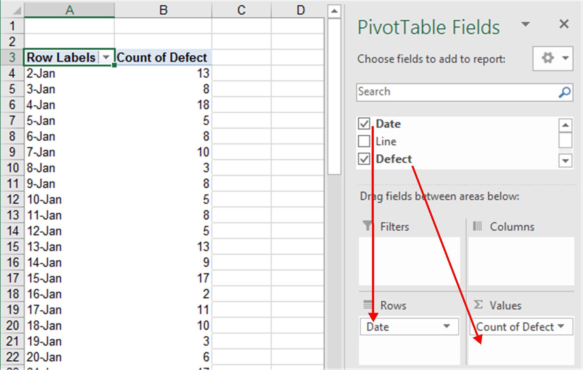
Then, click OK and Excel will provide a template (Figure 4) to organize the data. You can then drag and drop fields onto the template (Figure 4). Excel will summarize the data by date.
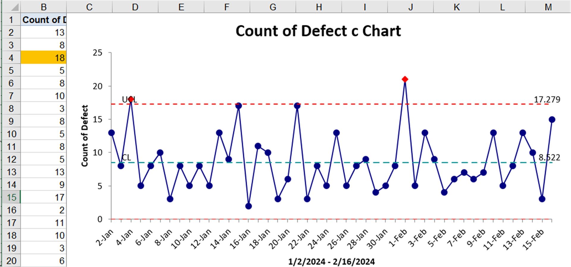
Now we can draw a control chart of defects by day (Figure 5). There is a couple of out of control points, but generally stable.
Next, we can modify the PivotTables fields to find the most problematic production line and type of defect (Figure 6). Note that fields such as “Defect” can be used for labels and counts.
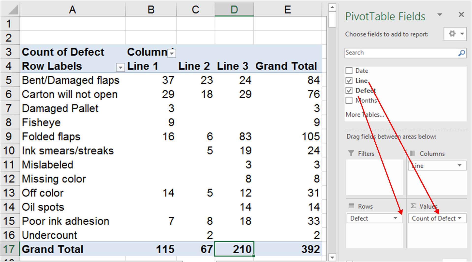
Now using the labels in A4:D4 and totals in A17:D17, we can draw a Pareto chart of total defects by line (Figure 7).
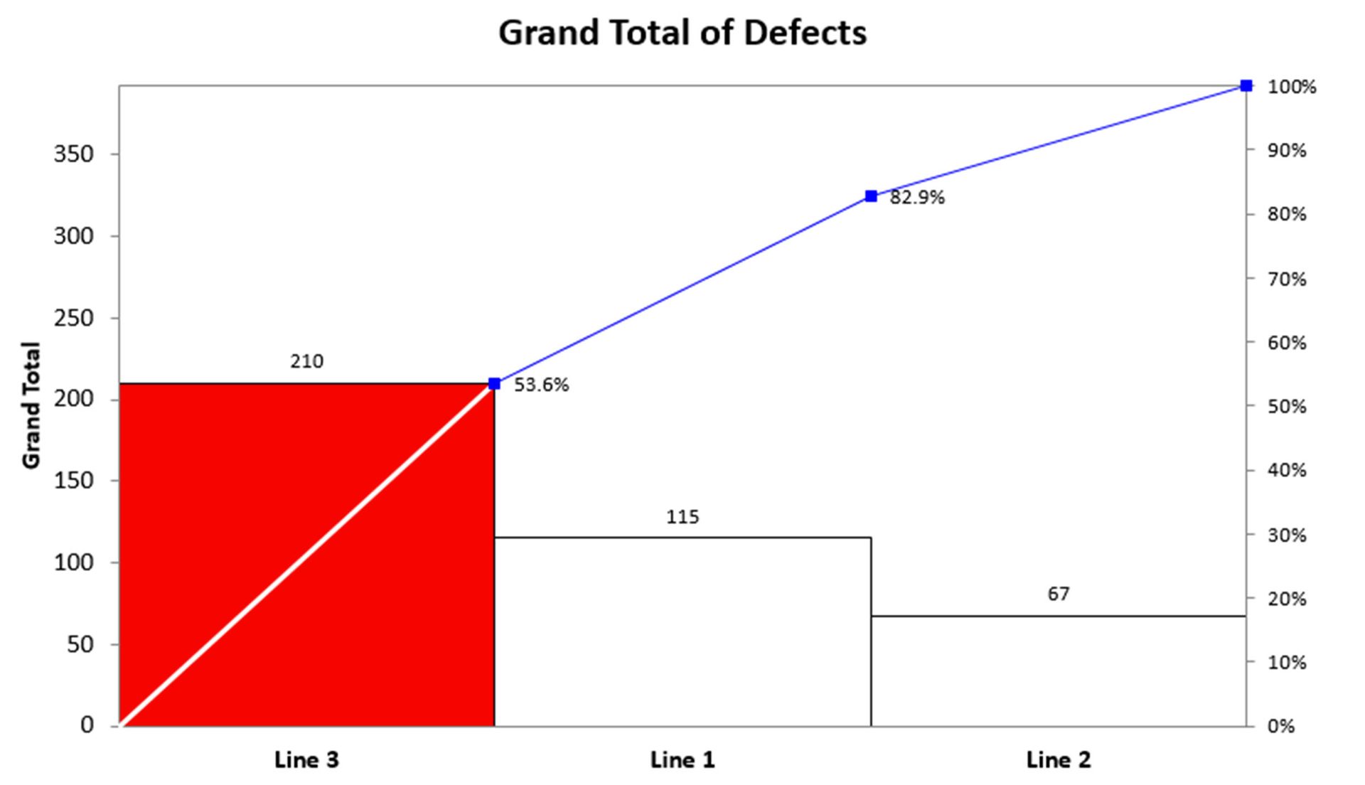
Line 3 accounts for 53.6% of all packaging defects. But I never stop at the high level (80/20 Rule) data. In this case, we could use the Defects for Line 3 (cells A4:A16 and D4:D16) to create a Pareto chart of type of defects in Line 3 (Figure 8). I call this the 4-50 Rule Pareto chart; as little as four percent of your business is causing over 50 percent of the waste, rework and lost profit.
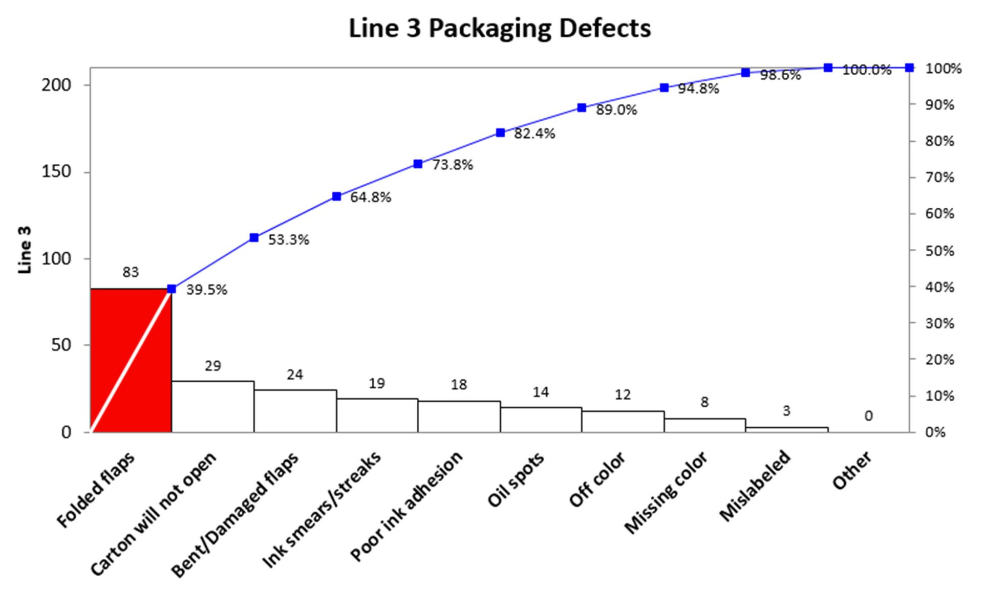
Folded flaps accounted for 39.5 percent of packaging defects on line 3. Using this analysis, we can create a fishbone diagram for root cause analysis (Figure 9).
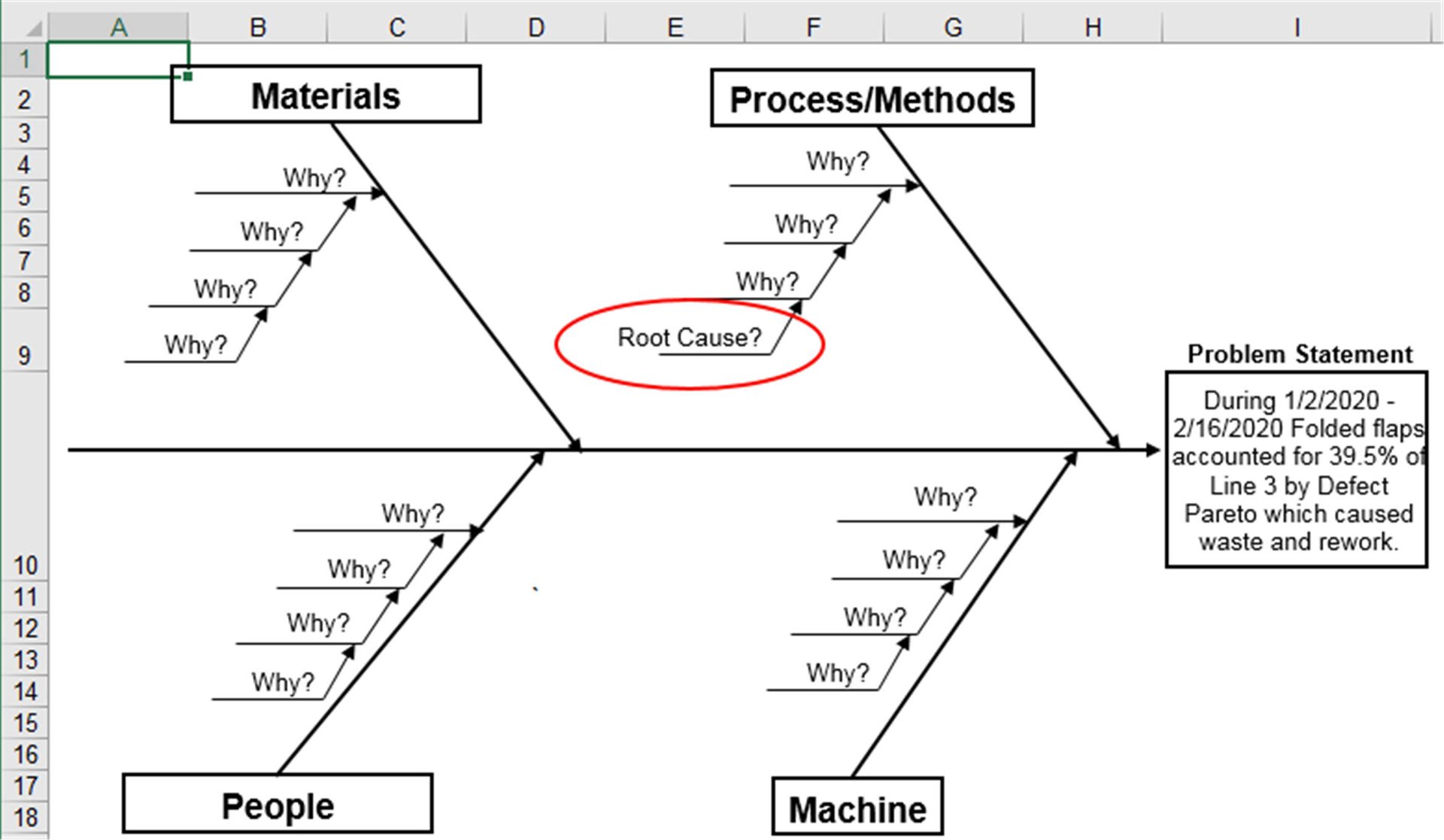
I have found that at this point we know who should be on the improvement team: people on Line 3 that know something about folded flap defects. Too many teams start with ill-defined problems and end up “whalebone diagraming,” which means they haven’t narrowed their focus enough.
Drilling Down into Data with PivotTables
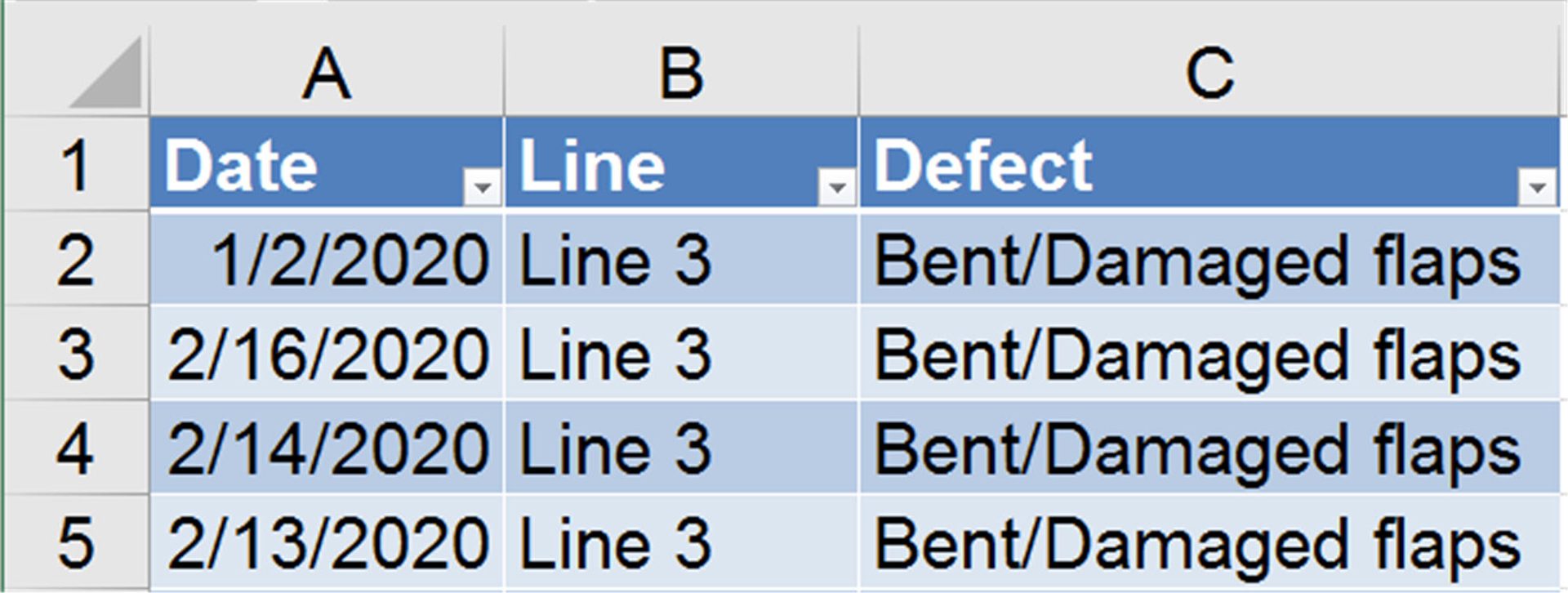
One of the great features about PivotTables is the ability to double-click on any cell and get all of the data behind it. If for example, I had double clicked on the total value for Line 3 (cell D17), Excel would have brought up all of the data behind it (Figure 10). I could then create a new PivotTable to summarize that data and create the Pareto chart in Figure 9. I have gone down multiple levels to find the Pareto pattern in the data.
Setting Up Your Spreadsheet for PivotTables
PivotTables can get cranky if you don’t follow these guidelines:
- Each column must have a unique heading
- No blank columns
- Cells with no data should be left blank
- Data should be consistent (e.g. Scrap vs Scrp)
The Profit Finding Process
The process is simple
- Find, collect or export an Excel file of defects, mistakes or errors.
- Use Excel PivotTables to summarize the data by date and type of defect.
- Create a control chart of defects per day, week or month. This will be the way to measure and monitor the performance.
- Use Pareto Charts to analyze various Pareto Patterns in the data. There are often many. Once a likely Pareto Pattern is found, drill down in the PivotTable to see if there’s a way to sharpen the focus. The narrower the focus the easier it will be to find a way to mistake-proof the process and prevent the defect.
- Analyze the root causes of the defect and develop countermeasures to prevent it.
- Implement the changes and validate that they improved performance, reduced costs and increased productivity.
- Repeat until all of the defects are eliminated.
This process helps find the invisible low-hanging fruit in any business. PivotTables help find the Pareto Pattern hidden in spreadsheets filled with text data. The simplest way to find the moldy portions of your business is to use the power of Excel PivotTables.
It’s not hard, but it will require some exploration and practice to develop the skills required
Haven’t you waited long enough to start finding the hidden gold mine in your business? Tired of waiting on Big Data to deliver results? Learn how to find the big money in your small data.
