Software & Analysis
Control Chart Analysis
An example. By Paul Keller
An SPC (Statistical Process Control) Software customer recently inquired if I could discern any issues in a process, as their customer had identified problems with three recent shipments. They provided data for the customer’s current year shipments for a variety of KPI (key process indicators) in an Excel file.
The Excel file provided 45 data values for each characteristic (KPI), with lot number, date, and occasional zero values where data records were missing. After opening the file in our software, I setup the following characteristic properties in one of the characteristics, then copied that to the other characteristics:
- Filter to show only non-zero values.
- Date on x-axis.
- Symbols to identify the three suspect lots.
- Curve fit based on Normal distribution.
The non-zero value filter was applied as a quick remedy to exclude bad data. The x-axis set to date provides a convenient way to identify specific data; lot number might also be useful in its place. The special symbols (blue triangles) allow us to quickly identify the three suspect lots on the chart. The default curve fit is set to a Normal distribution as a standard assumption. If the process is in control, we can evaluate the K-S (Kolmogorov-Smirnov) statistic for the Normal distribution to verify a reasonable fit. If the K-S value is less than .05, then there’s reason to fit an alternative distribution for capability analysis and for control limits on the observations. If the process is not in control, then it is inappropriate to fit a single distribution to the data. In that case, the out of control conditions indicate that the process distribution has changed. This explains the need to include a control chart whenever quoting capability estimates: The capability estimate is only valid for a controlled process. (See also my Quality article from June 2011: Is Your Process Performing? for further discussion).
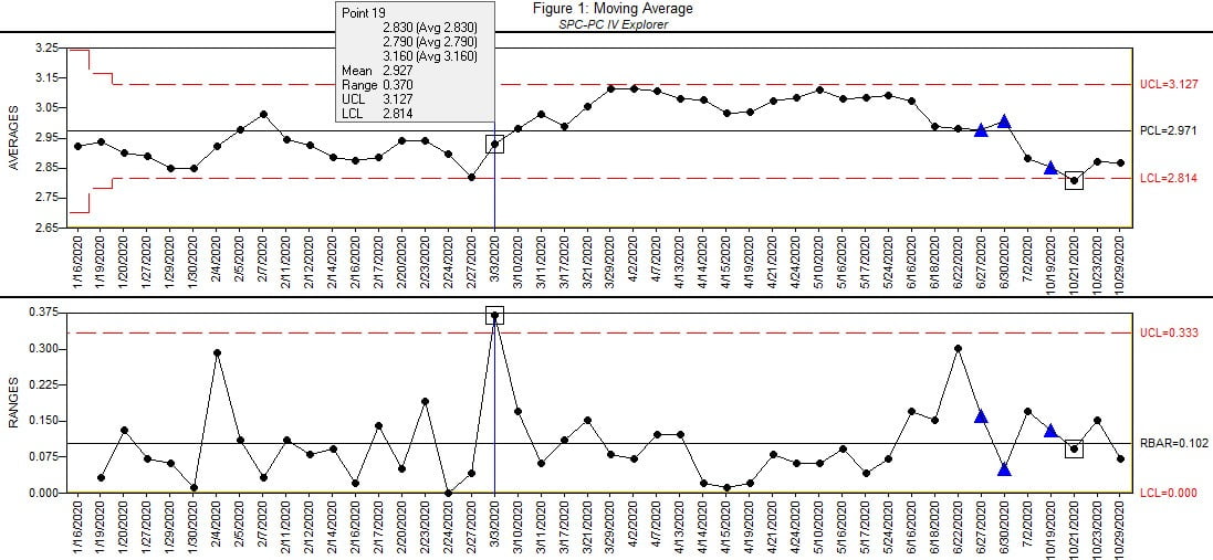
Figure 1. Source: Quality America
When the rational subgroup size is one, as in this case, users are often tempted to analyze using an Individual-X / Moving Range chart. While we will use this chart in our analysis, we will supplement with a Moving Average chart. The Moving Average chart plots the average of a moving cell of constant size. The Moving Average chart shown in Figure 1 uses a moving cell of size 3: the first complete plotted group will contain the first, second and third observations; the second complete group contains the second, third and fourth observations; and so on. (The expanded limits for the first two plotted values indicate they include less than three observations). The advantage is that the chart is plotting an average, so we can reliably calculate control limits at +-3 sigma (of the moving averages), even if the underlying distribution of the observations is severely bounded. With bounded distributions common when plotting cycle times, flatness, and cut lengths (to name just a few such metrics), the Individuals chart’s standard control limits at +- 3 sigma can produce control limits far from the bound, where data cannot possibly exist (such as negative values in the case of cycle time or flatness). This non-sensible control limit is thus irrelevant, and the chart has lost sensitivity in detecting real shifts in the process. The Moving Average chart will allow us to review the process for control without making any assumptions of the shape of the process distribution. If the process is in control on the Moving Average chart, then we can fit a distribution to that data and use that for our capability analysis, as well as for control limits on an Individuals chart.
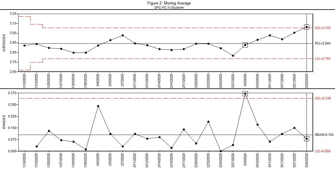
Figure 2. Source: Quality America
The Moving Average chart in Figure 1 shows its first out of control group at the selected group 19 on the Range chart, indicating a process shift. The Range statistic is based on the range between the moving cell of 3 observations, so as the process jumped upward on March 3, the Range chart detected the shift. Looking at the Moving Average chart in real-time, adding one group at a time, it detects the shift 5 groups later, as shown in Figure 2. Note that Run Test rules are not applied on a Moving Average chart. The Run Test rules are largely based on independence of the plotted values, which is violated by the plotted moving cells in the Moving Range chart. In a moving cell of three data values, each of the three data is included in three plotted points, establishing dependence of the plotted values.
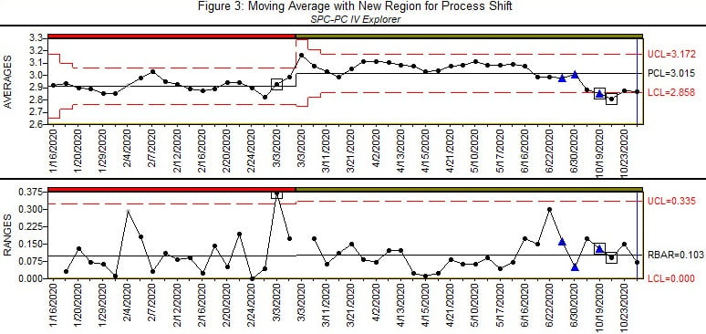
Figure 3. Source: Quality America
Figure 3 shows the Moving Range chart with a new control region established to accommodate the process shift. The process remains in control for a period, then an out of control condition is detected in the third suspect lot. The chart would suggest the process shifted in the preceding group. Note that control charts may not immediately identify out of control conditions, depending on the size of the shift and the statistics of the selected chart. In this case, it would be reasonable to assume the shift occurred in this preceding group.
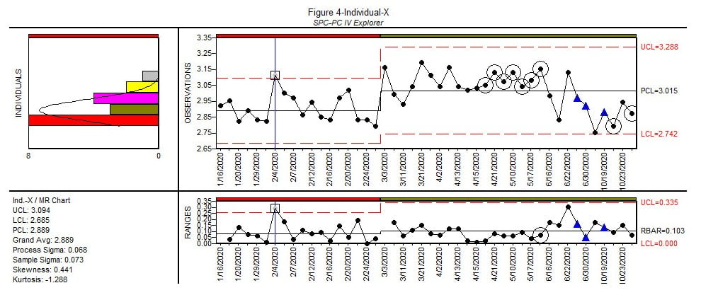
Figure 4. Source: Quality America
Figure 4 shows an Individual-X / Moving Range chart of the data, with the new region to accommodate the process shift verified in the Moving Average chart. (The Individual-X / Moving Range also detected the same process shift via the Moving Range chart on March 3). There is a group out of control in the first region (Feb 4) that was not detected by the Moving Average chart. Based on the histogram’s skewed distribution for region 1, it’s quite possible this group is incorrectly identified on the Individuals chart, where we are using standard +-3 sigma control limits. We would need additional data to determine a proper distributional fit for the process.
Later instances of Run Test 2 violations (Nine successive points same side of centerline) are indicated by the circles around the groups from April 19 to May 24. These Run Test 2 violations are due to the data plotted later, which is confirmed by removing the later data and adding them back into the analysis one group at a time. When done this way, the chart detects a process shift on the same plotted point as the Moving Average chart. When analyzing charts based on historical data, if control limits are updated with new data then it’s useful to add the groups one at a time to simulate the real-time chart, so the later data is not influencing the control limits and Run Test rules. This is an obvious benefit of real-time analysis of the SPC data.
Similar analysis was done on the other characteristics and provided further insight into potential issues that could be affecting the suspect lots. The analysis is incomplete, as it is simply based on the statistics of a relatively small amount of data. The intent of the analysis is to gain insight into potential periods of instability for the various characteristics, and use that to understand the process, especially with the input of subject matter process experts (including process operators) who are familiar with the dynamics of the process and can offer some practical reasoning for the potential process shifts detected by the analysis. My use of the word potential is out of an abundance of caution, based on the limited amount of data available. While lack of data might inhibit any bold assertions, it should not limit your curiosity, which the tools enable.
In discussing this with the Quality Manager, it turns out that this was only a subset of the total process data, including only the production lots that were sent to one customer. In that case, the remaining data (for other customers) can and should be included in the analysis to gain further insight into the process.
If you enjoyed the methodology and yearn for additional examples, you might revisit my April 2019 article in Quality: “How to Statistically Control the Process”.
Opening Image Source: gorodenkoff / iStock/Getty Images Plus via Getty Images.
Ian R. Lazarus is president and CEO of Creato Performance Solutions, providing leadership development, training, and solutions to support operational excellence.
Paul Keller is president of Quality America, a publisher of software and training for Six Sigma Quality Improvement. He has written several books, including SPC Demystified (McGraw Hill, 2011) and the third, fourth and fifth editions of The Six Sigma Handbook (McGraw Hill, 2009, 2013, 2018). For more information, email pkeller@qualityamerica.com or visit www.qualityamerica.com.
Jim L. Smith has more than 45 years of industry experience in operations, engineering, research & development and quality management.
February 2021 | Volume 60 | Number 2